Toronto Cupcake Redesign
PROBLEM: The current website design for Toronto Cupcake may be considered confusing, off-putting, and actually deterring potential clients from placing orders. Although Toronto Cupcakes has a 4.6 rating on Google reviews, this business is not representing its services in the best light, with its outdated UI. There are conflicting colors and a confusing menu working against them.
SOLUTION: Users will gain confidence in the company when the navigation is changed, designs are updated, and the ordering process is made easier and more appealing.
MY ROLE: UX Researcher/ UX Designer + Design the body of the website
User Journey
The Website (before)
Homepage
Occasions Landing Page
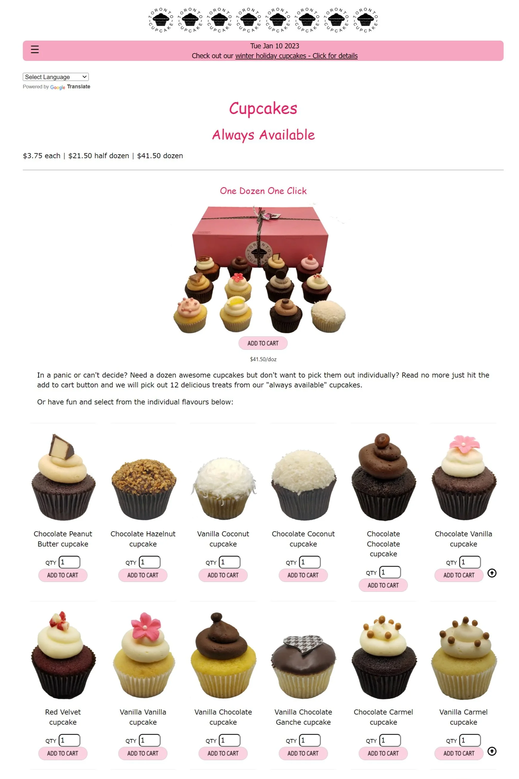
Always Available Landing Page
We began making a list of elements we wanted to change—
Make the font more consistent
Put the menu at the top of the page instead of the bottom
Get rid of the multiple contrasting shades of pink
Add more color
Get rid of the multiple logos at the top
Update the logo
Add cupcakes to the homepage
Add a shopping cart
Change the quantity input method
Use more appealing images
Add phone number and hours of operation to the homepage
Research
We started by asking for feedback on the website via a 15-question survey. We found that a lot of people disliked their experience with the site navigation, the order process, and the design of the website. So, we conducted a competitive analysis to see how some of the company’s competitors were accomplishing these priorities.
Mood Board
Design System
We opted to preserve the color scheme that the original website used
We chose two shades of pink for consistency as the website used too many contrasting pinks before (we counted 9 different shades).
We redid the logo to make it more legible and stylized
Paper Prototype
I created a paper prototype that embodied some of the changes we wanted to see. It was important to us to get the user shopping on the home page of the website so it was more like an e-commerce site. Notice the ‘+’ and ‘-’ buttons which made changing the quantity more enjoyable for the customer (instead of having to type in a number).
The Website Redesign
Homescreen
Always Available Landing Page
Cart Overlay
Final Thoughts
After our updates, users found this website much easier to use. The first time we tested it users gave mixed reviews because of the confusing navigation and unappealing UI, and the second time users gave all 5s (for easy to use) because we implemented the top navigation, cart, and shoppable homepage.
Although the homepage and the ordering landing page look similar, we felt it was important to get the users shopping on the homepage as soon as possible.
We are happy with the subtle yet powerful changes we made to the website and strongly believe these changes would increase site traffic and cupcake orders for Toronto Cupcake.


